Course Overview
|
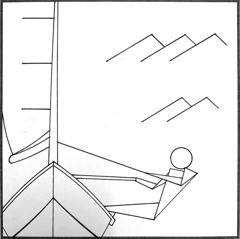
Technical Olympic SymbolAfter first diving into a refresher in the elements and principles of design, the first project was the technical Olympic Symbol Illustration. I was tasked with creating a pictogram of my chosen olympic event using technical illustration. I chose sailing to be as close to my interest in boats as possible. After 24 thumbnails and numerous attempts at pen drawing, I was able to produce the final product. Though this project was simple, it was one of my favorites as it combined the cleanliness and precision of mechanical drawing and creative freedom to choose any symbol I want. However, looking back I would've liked to change the waves in the back to look more like actual waves rather than mountains.
|
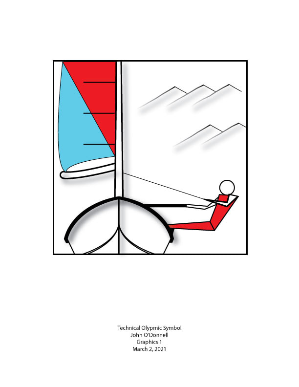
Digital Olympic SymbolThis next project was our first exposure to the actual software using Adobe Illustrator. I took the Olympic symbol I had created in the project before and draw it in Illustrator. This proved to be more challenging than I had anticipated as moving from AutoCAD to Illustrator was a big adjustment. Illustrator seemed at first to be counterintuitive, but after a couple days of fighting the software I finally had my symbol drawn. A Problem arose when I went to add colors because I drew my whole project using single lines, not whole shapes. Thus, my project lacks a variety of color.
|
|
|
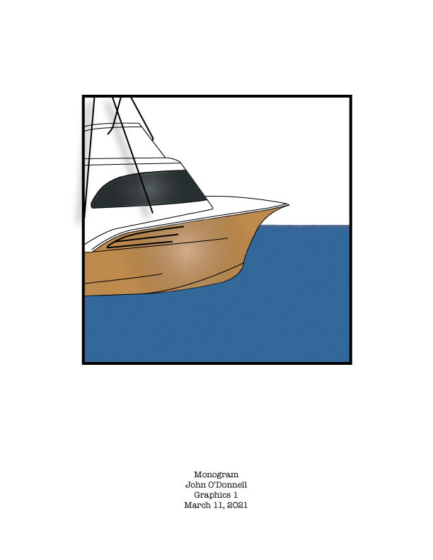
Monogram After our introduction in illustrator with the Olympic symbol project, we moved into a more complex project to test our skills at the pen tool. I was tasked with Creating a graphic of a monogram that tells the reader something about me, while seeing a letter form or letterforms hidden in the graphic. Through this project, I was able to exponentially increase my skills with the pen tool and try out more of the effects that Illustrator has to offer. I had my heart set on a boat shape and thus, my letter wasn't as obvious as it should be.
|
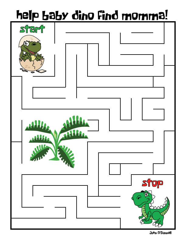
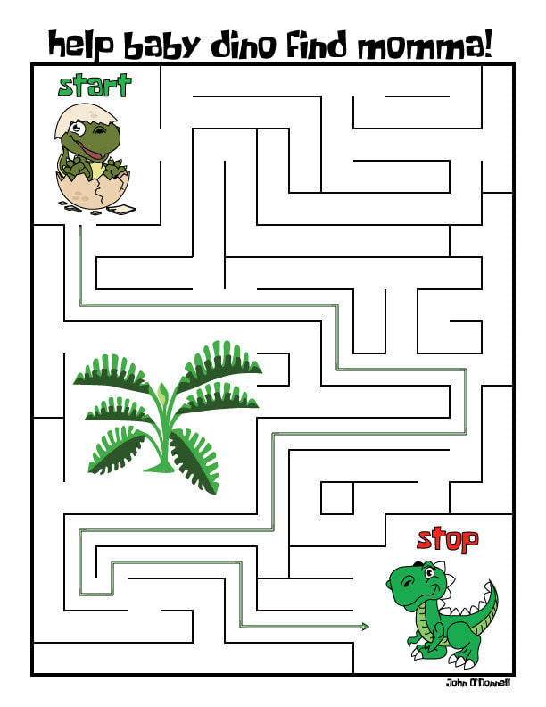
MazeI was then tasked with creating a maze for children between the ages of 4-7. I had to make the maze appealing to children by choosing a theme and pulling graphics from the internet to trace with the pen tool as inspiration. This project even further cemented my skills with the Illustrator’s pen tool. This pen tool is so important because it is the main function of Illustrator as a high end connect-the-dots software. We also dove more into type styles and effects. If I had to do it again, I would make the path out of dinosuar foot prints.
|
|
|
Logo
By far my favorite project at this point in the course, the logo gave me the most freedom to create something I really liked. Through my research for types of logos I favored, I found that I liked simple silhouettes the most. This prompted me to create a simple silhouette of a sportfishing yacht and gradient waves to give the viewer a sense of movement in the graphic. My fictitious company name is John Boats, which juxtaposes the traditionally small and simple Jon Boat and the massive luxury yachts I would be producing. It also includes my name which gives it the personal touch it needs. The text perfectly complements the cleanliness and simplicity of the graphic. My only dislike would be outrigger stretching from the boat and making the graphic an odd shape.
|
|
|
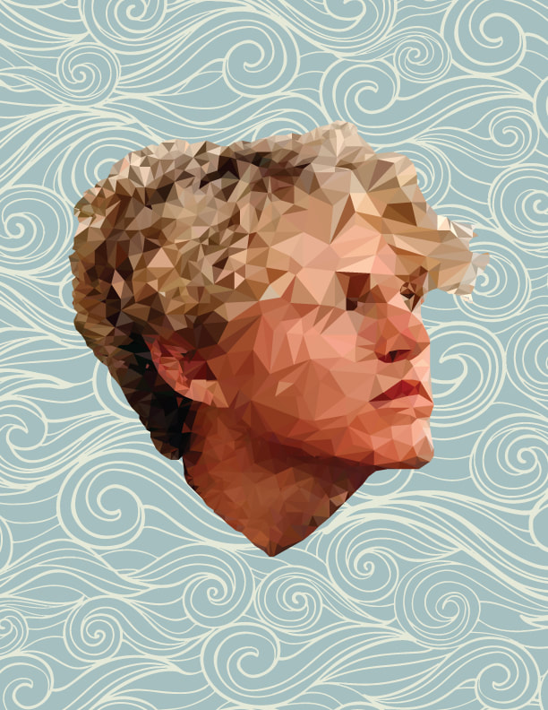
Low PolyThis project, although very time consuming, was the most rewarding. I had to create a low poly geometric portait using only Illustrator's pen tool and eyedropper. Using hundreds of little triangles, an image of my face appeared. I love how much detail is in the bottom of my face and neck and the back of my head. The background also fits my love of the ocean but doesn't washout my face. If I could do it again, I would use much smaller triangles around my nose and eyes to give them more detail.
|
|
|
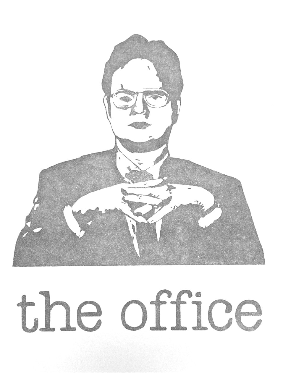
One Color Hand Cut ScreenFor this Project, we were produce five high quality, one-color screen prints on paper of a self-selected/generated image. Dwight Schrute, a starring character in my favorite show The Office, was the image I selected. This image was extremely conplex with all the shadows and contors of his face. I was able to preserve most of the detail but areas around the eye and hands lost some detail. If I got to try it again I would try to mix some colors because the silver is too plain.
|
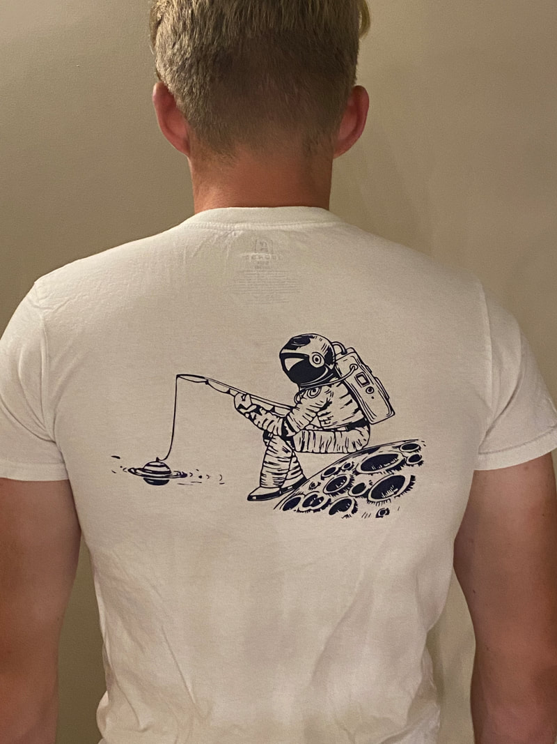
One Color Shirt DesignThe second of our screen printing projects was making our own unique shirts. For this, we had to design an image to be screen printed on a shirt and provide justification for content and marketability of your shirt. I chose have an astronaut sitting on the moon and fishing. This again displays my affinity for fishing but also fits with modern fashion. The Astronaut gives a futuristc look to the shirt that makes it wearable today. my favorite part of the whole graphic is that the astronaut's bobber is Saturn. If I could Print it again, I would mix alittle glittery red in to give the dark blue some texture and pop of the shirt.
|
|
|
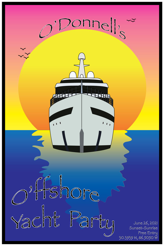
Event PosterFor the final large project of the course, I was tasked with creating a poster promoting an event of my choosing. I chose to promote a yacht party on Crab Island in Destin, FL. The party is free for anyone whole pulls up an anchors thier Boat and goes from sunset to sunrise. Using the O' in my name, I came up with the name for the event. I really love the formatting of the text and the gradients of the sun and sky. If I could do it again, I would blend the boat more into the water and make the boat alittle more dull to better represent the low light.
|
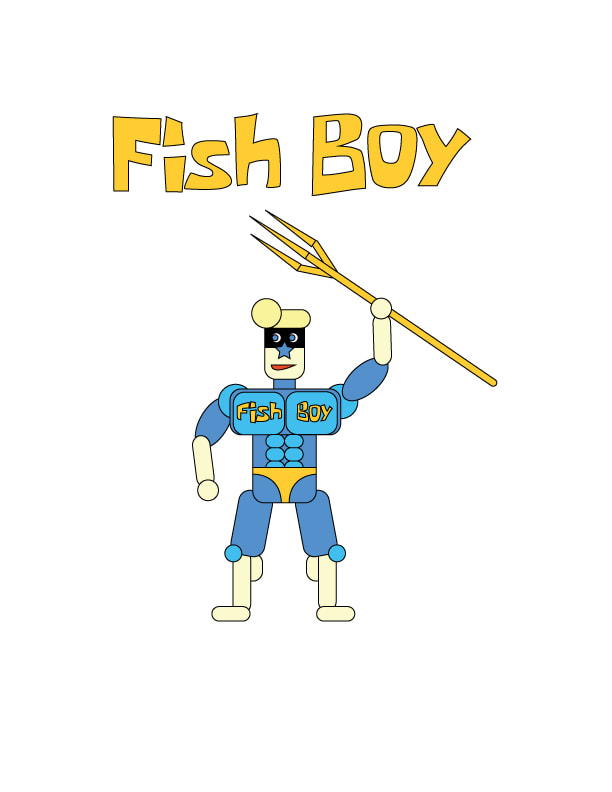
Super HeroThe first of 3 tutorials, I was supposed to turn myself into a superhero character based on the style of the provided tutorial. Using simple geometric shapes, I created Fish Boy. Fish boy looks like me with slightly less muscle mass but a connection to the sea that is unparalleled. I love the colors but I would've liked to have chosen a more heroic stance. He seems more like a villain stance to me.
Backstory: While deep sea fishing I was dragged down to the depths of the ocean by something massive. I lost consciousness after seeing a gold and blue creature quickly swimming away. When I came to, I was suspended hundreds of fathoms below the surface, but breathing. I started swimming and breathing until I stumbled across a golden trident. I started fighting against ships destroying the ocean to defend against the extinction of the seas. |
|
Logo TutorialI love this simplistic logo style. The cleanliness and effectiveness of a logo like this is unmatched. It conveys a message while being visually appealing.
|
|
|
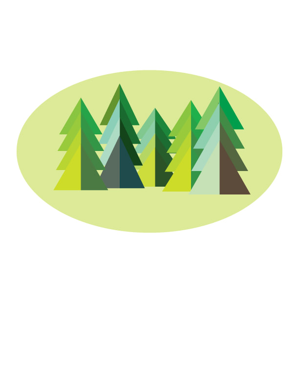
Landscape TutorialAgain, the simplicity of this design is evident but the effeciency is unmatched. This is the type of design that I really enjoy doing because it may seem easy, but the color combinations and balance of the graphic have to be correct. If it isnt't correct, the design won't be appealing just look off.
|
Extra Creations
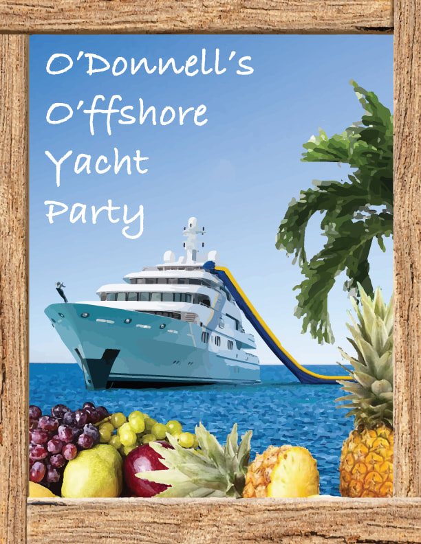
Mock Up Event PosterThis was a quick mockup of an event poster that I did to get an idea of whether I wanted to do something more detailed or simplistic. Using images from the internet, I converted them to high Fidelity Images and combined them to make the promotional party image you see here. I didn't take my project in this direction, but I thought it looked too cool not to share.
|
|
|
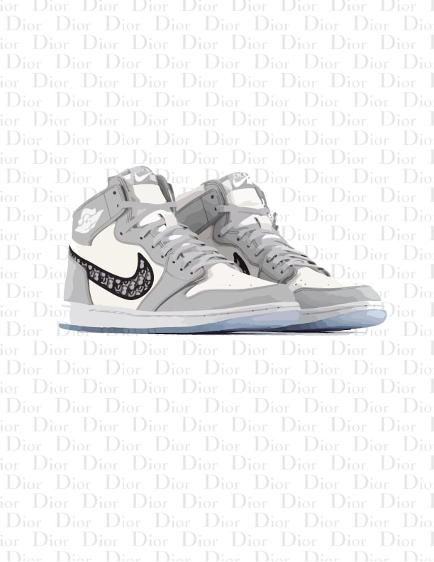
Dior JordanI wanted to create background for my phone that would incorporate my love for shoes and one of the coolest shoes in my opinion. By converting the shoes to a love fidelity image, I dropped in a wallpaper and created the design you see here.
|
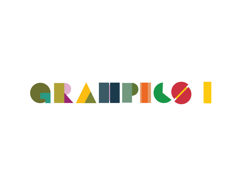
Graphics 1 TitleI couldn't find an image I liked to be the header for this page, so I created my own. Using a simple alphabet I created these figures and the array of colors shown.
|
|
